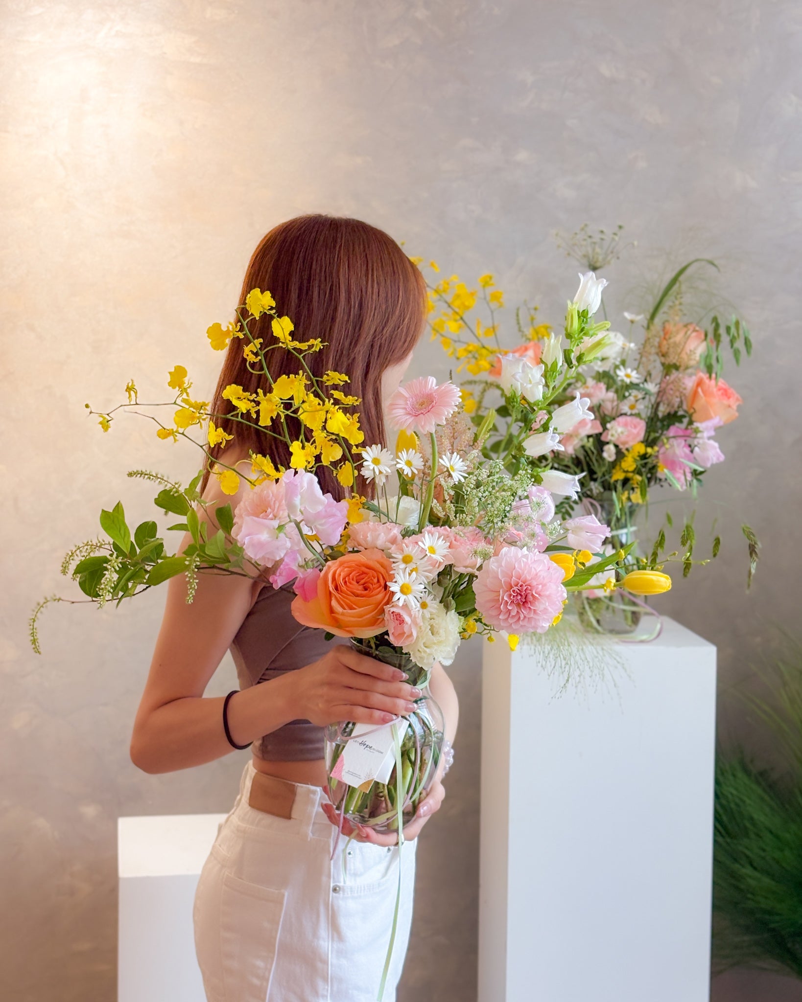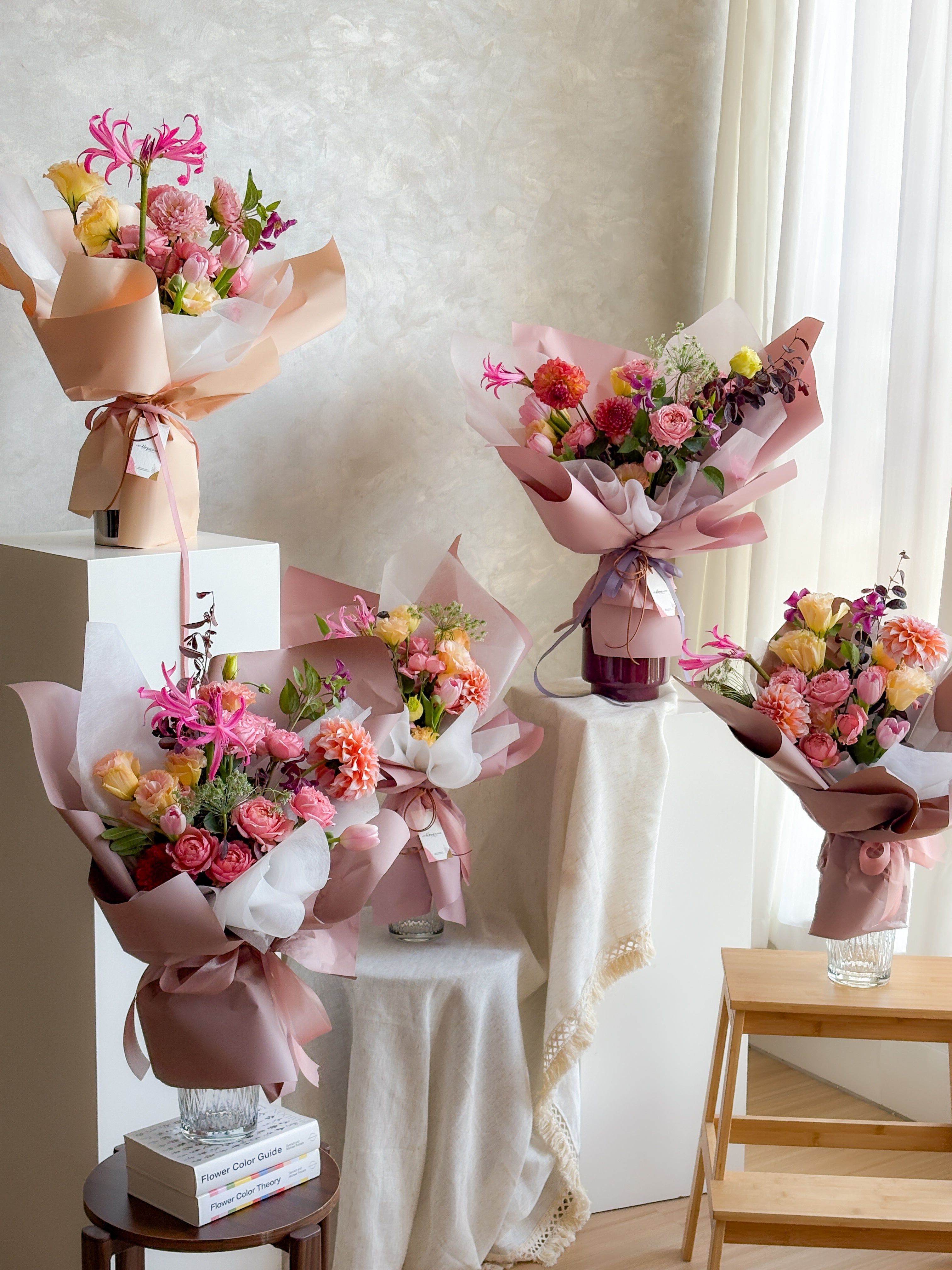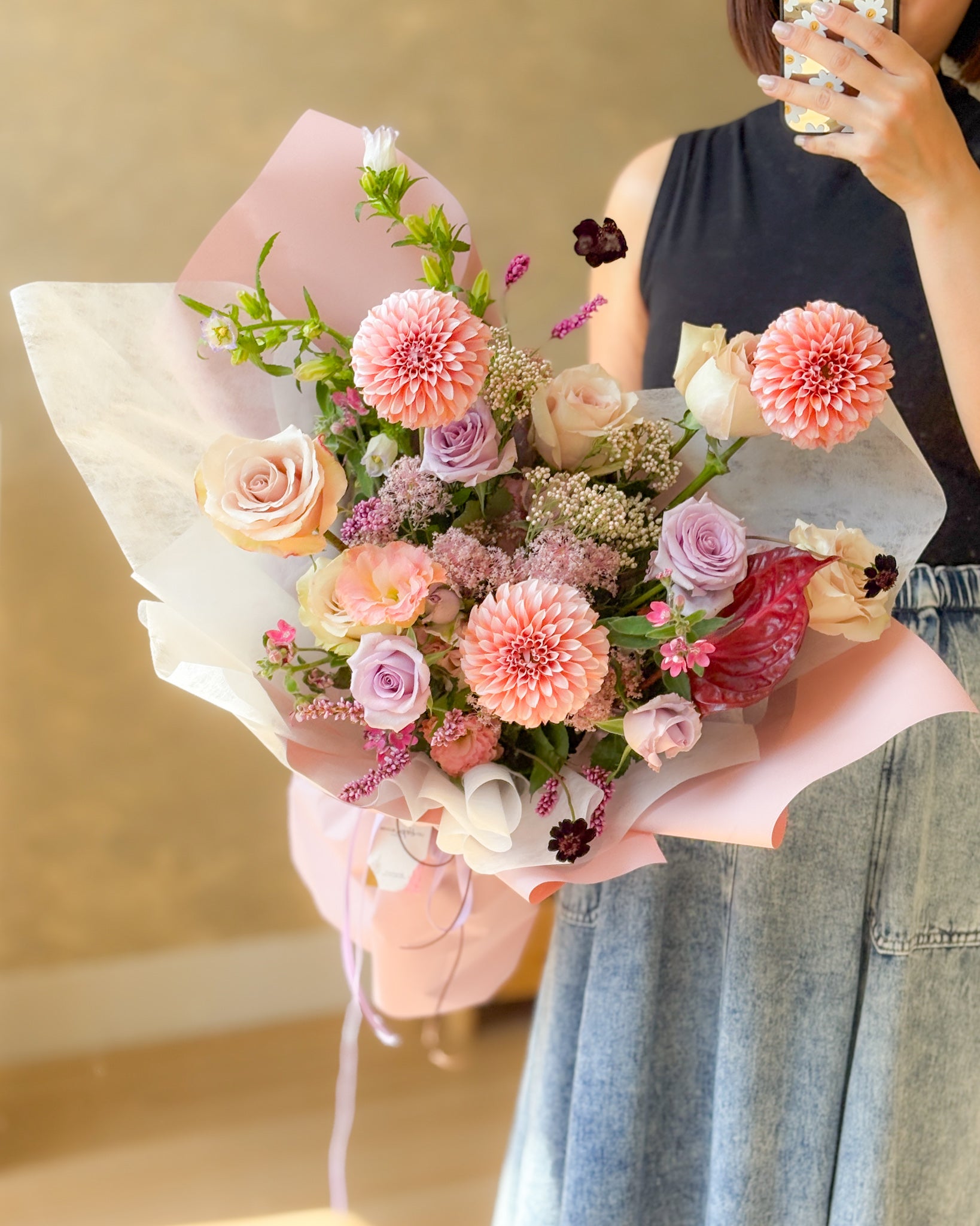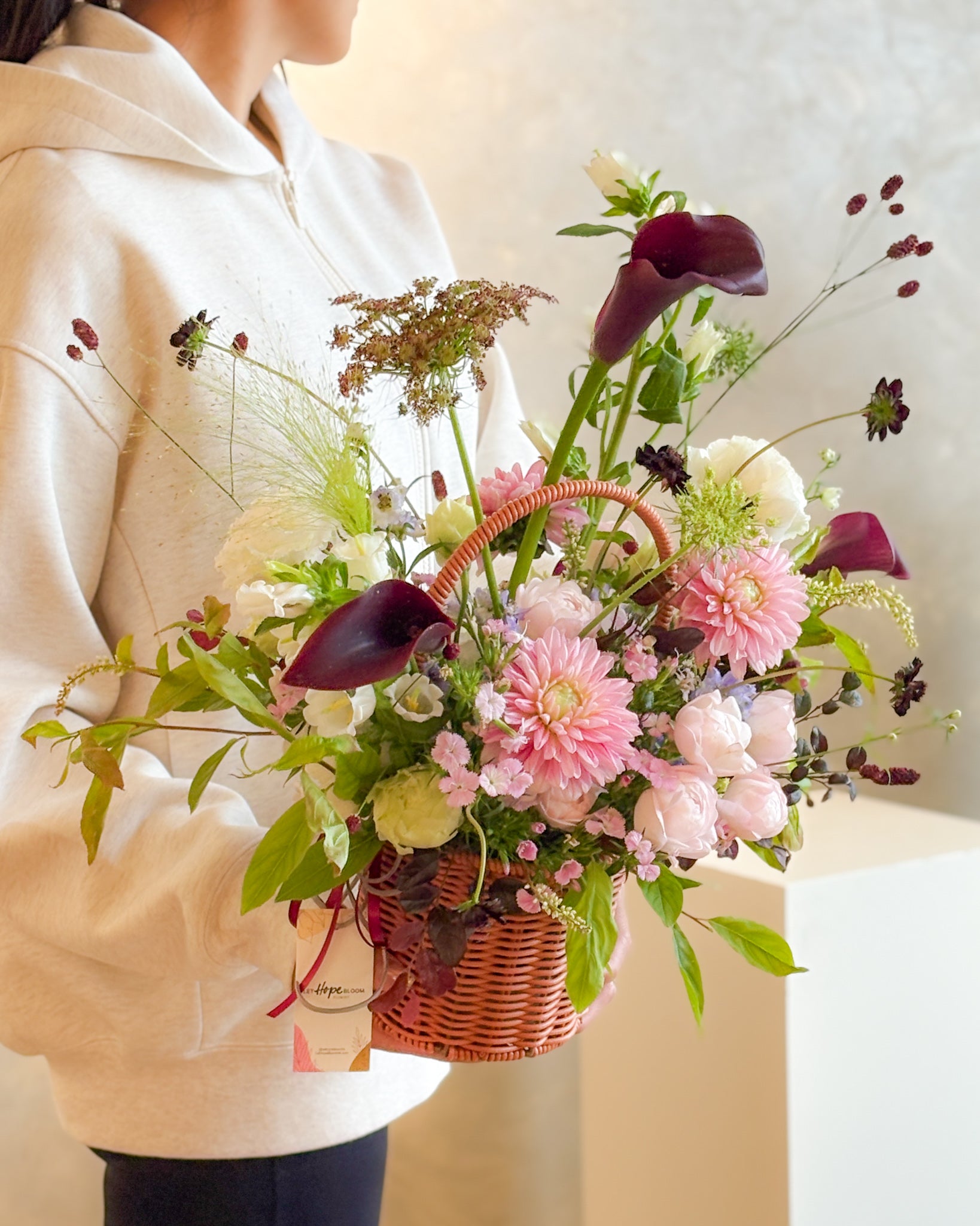

【Floral Color Theory】Fresh Flower Color-Matching Techniques: The 60-30-10 Rule — A Beginner’s Guide to Flower Arranging in Hong Kong
Have you ever picked out a large bunch of flowers at a flower market because you thought they looked beautiful, only to find that the result was completely different from what you expected after arranging them in a vase at home?
Every flower is beautiful on its own, yet when placed together, something just does not seem right.
This is not a matter of aesthetics.
Most people choose flowers instinctively, but intuition without the support of basic concepts is often unreliable.
At Let Hope Bloom’s floral design classes, this is almost the first question every new student asks in their first lesson—and the answer is actually colour theory.
1. Colour is not simply a matter of whether something “looks good”
Before choosing flowers, you need to understand that colour has three dimensions. It is not as simple as red, yellow, and blue, but consists of three elements that directly affect the appearance of a bouquet.

Hue refers to the pure colours on the colour wheel: red, orange, yellow, green, blue, and purple. Most people stop at this level when choosing flowers, but relying solely on hue combinations can make a bouquet look flat and lacking in depth.
Value is the lightness or darkness of a colour. Adding white makes a colour feel lighter, producing shades such as peach, powder blue, and light purple—the signature colours commonly used in Korean-style bouquets. Adding black makes a colour more grounded, creating shades such as burgundy, deep purple, and dark forest green, which are suitable for large-scale installations or occasions seeking a luxurious feel.
Saturation is the purity of a colour. Adding grey to a primary colour produces the much-loved “Morandi colours”, such as vintage rose, earthy brown, and rust red. These understated, refined, and highly photogenic tones are the result of reduced saturation.
These three dimensions form the foundation of floral colour coordination.
2. Warm vs. cool colours: Not just a visual impression, but the atmosphere of the entire space
Colours have temperature, and that temperature directly affects the atmosphere conveyed by a bouquet.
Warm colours (red, orange, yellow) are full of energy and have a visual pull that brings them forward. Warm colours are the first choice for larger spaces or when you want to create a focal point or a lively atmosphere.
Cool colours (blue, green, purple) create a sense of calm and appear to recede visually. In smaller spaces, or when you want the environment to feel more spacious, cool-coloured flowers can be especially effective.
One easily overlooked point is the trap of white flowers. White may appear neutral, but pure-white petals are actually very rare in nature. Most white flowers have either warm undertones (ivory or cream) or cool undertones (white with a slight hint of blue). If warm whites and cool whites are mixed, a warm-white flower can appear yellowish, as though it is not fresh enough.
3. 60-30-10: The florist’s golden ratio
To give a bouquet depth without making it look cluttered, you can use the 60-30-10 colour rule commonly used in interior design.
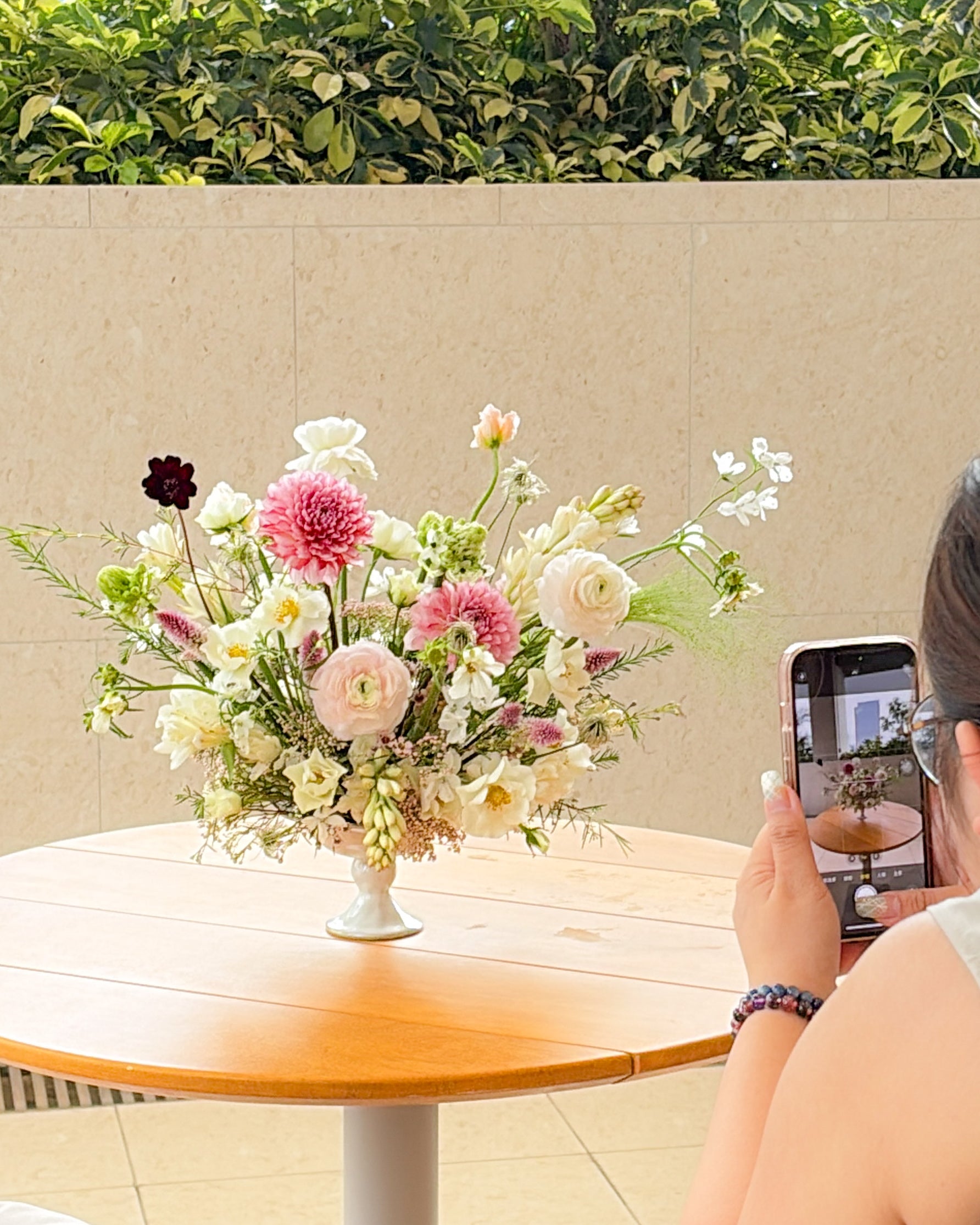
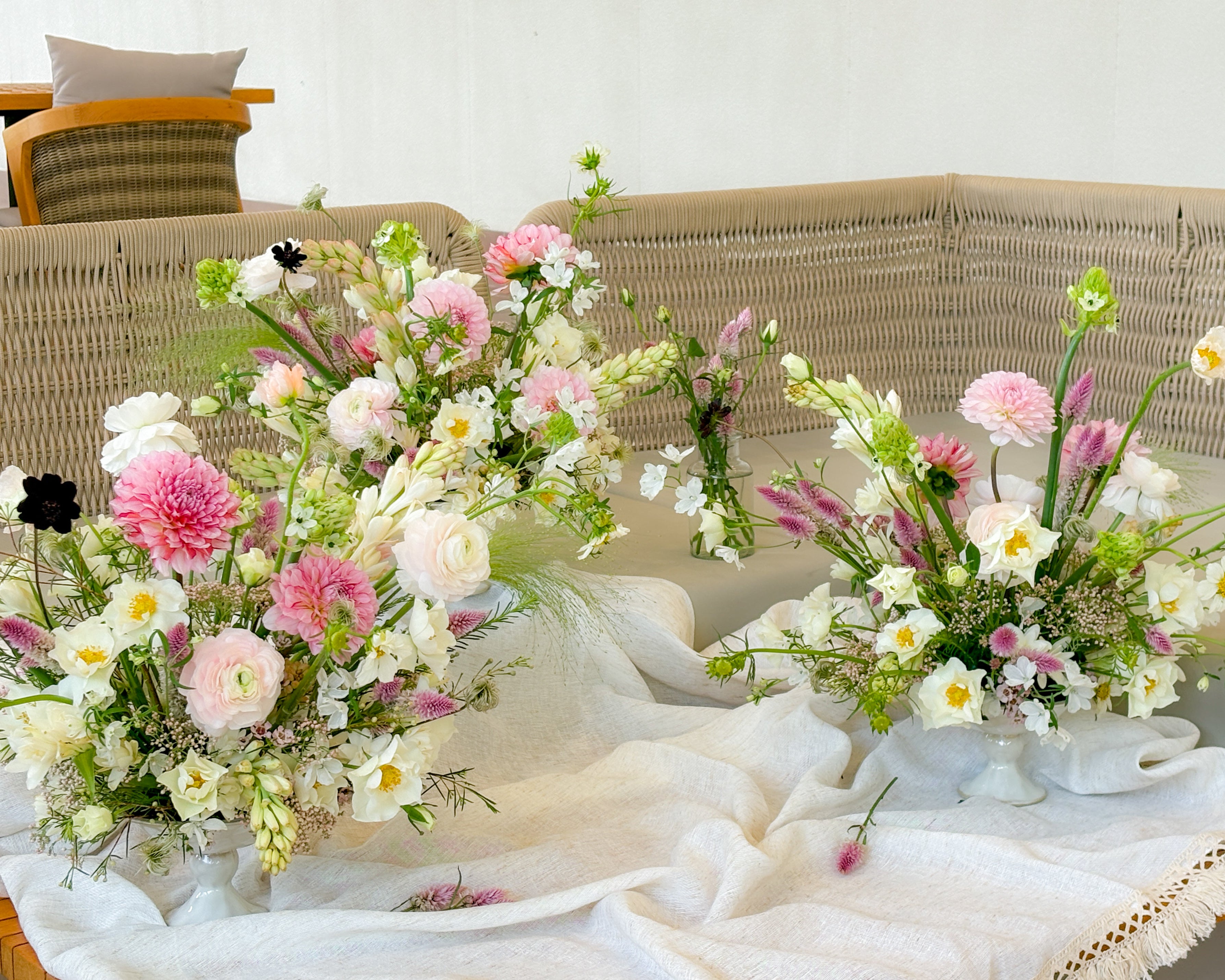
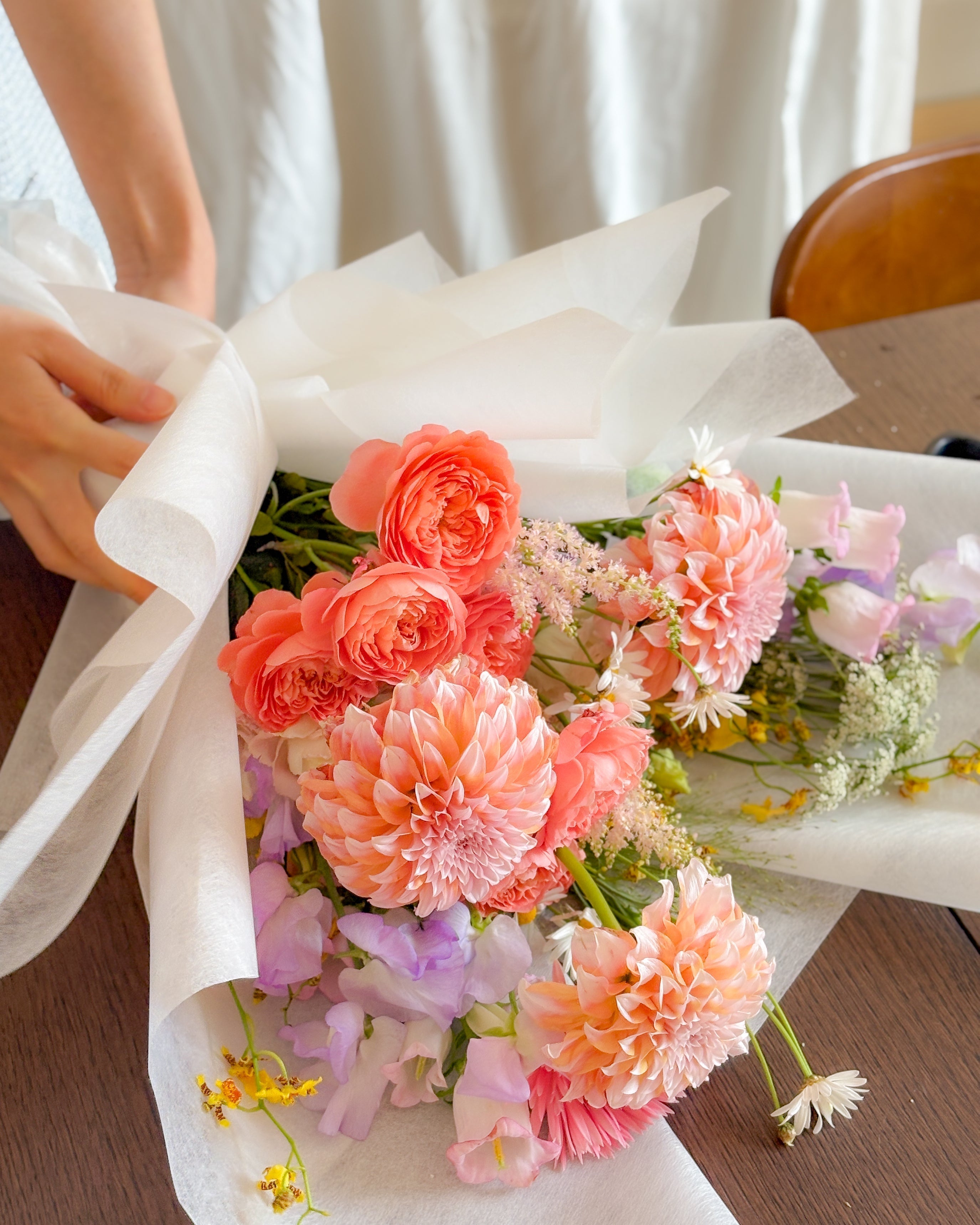
60%: Dominant colour The colour that occupies the largest proportion of the bouquet, usually coming from the most eye-catching large flowers, such as peonies, roses, and Dahlia. It is the soul of the entire bouquet and the key to setting its tone.
30%: Supporting colour Medium-sized flowers used to support the main colour, such as tulips, spray roses, and lisianthus. They do not steal the spotlight, but make the bouquet fuller and give it greater depth.
10%: Accent colour The key stroke that brings a bouquet to life. It could be tiny flowers, foliage with a linear quality, or a strongly contrasting accent colour. This 10% often determines whether a bouquet leaves a lasting impression.
4. Five colour schemes that beginners can easily master

If you still do not know where to start when looking at the colour wheel, the following five colour schemes are the safest choices:
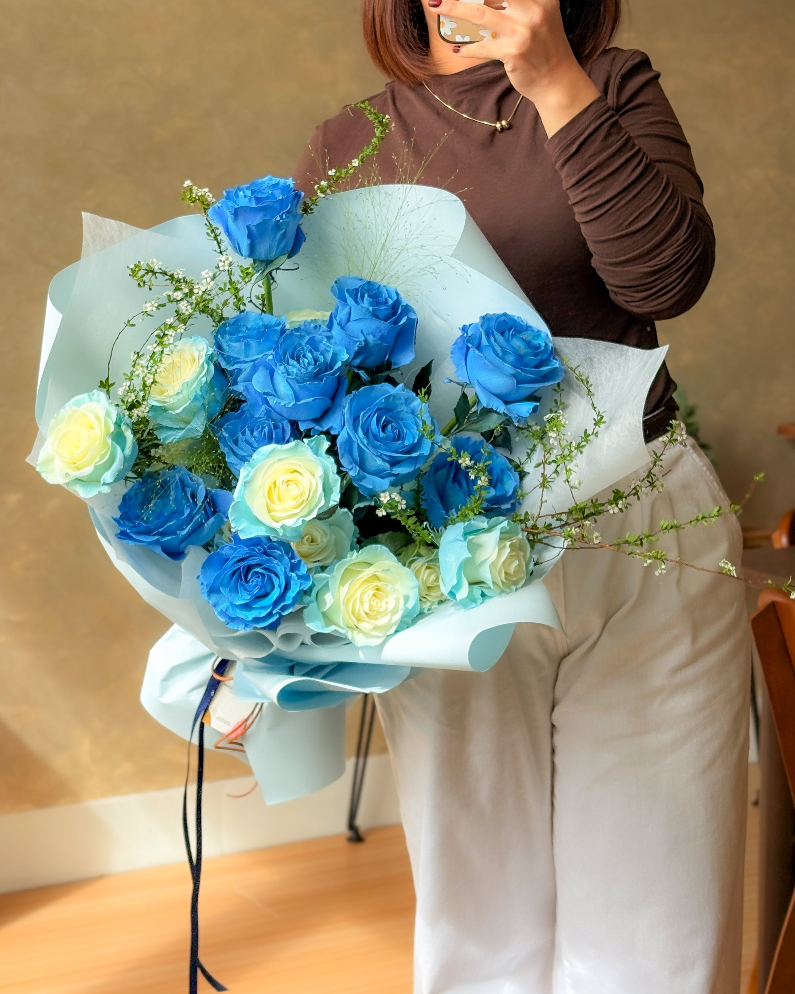
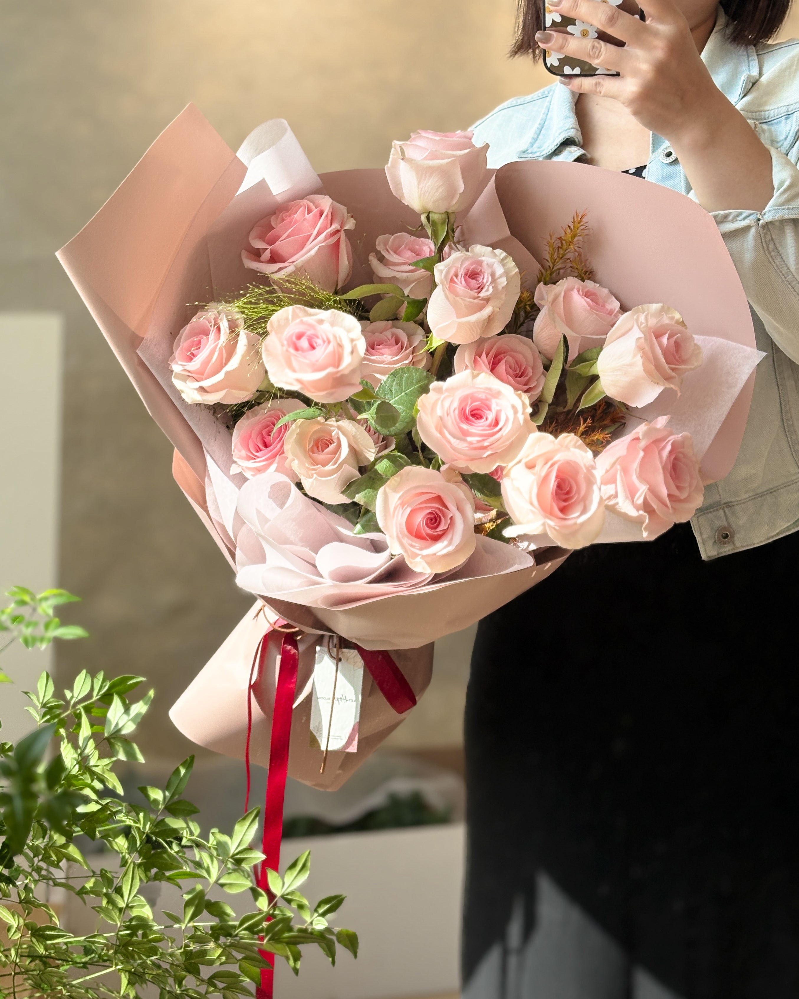
- Monochromatic: Using only one hue and creating depth through variations in value and saturation, such as a combination of light pink, dusty rose, and burgundy. This produces the most cohesive look and the greatest sense of sophistication, making it ideal for creating a particular atmosphere.

- Analogous: Three adjacent colours on the colour wheel, such as yellow, yellow-orange, and orange. The transition is natural and visually pleasing, making this the most commonly used and easiest-to-master colour scheme for Korean-style bouquets.

- Complementary: Two colours opposite each other on the colour wheel, such as red and green, blue and orange, or purple and yellow. The strong contrast creates a dramatic feel, making it suitable for brand events or arrangements intended to attract attention.

- Split Complementary: Pairing a main colour with the two colours on either side of its complementary colour, such as blue with yellow-orange and red-orange. It retains the energy of complementary colours while appearing gentler visually, making it suitable for beginners to practise.

Split Complementary
- Triadic: Three colours that form an equilateral triangle on the colour wheel, such as purple, orange, and green. Even when using pastel shades, this combination can create a rich and lively effect, making it suitable for celebrations or festive floral designs.

5. Three colour-coordination mistakes you may not have noticed
Mistake 1: Using too many colours. Trying to use every colour can ultimately make the overall design look chaotic. It is recommended to limit the palette to two or three harmonious colours. The more refined the palette, the more skill it requires—and the easier it is to create an effective result.
Mistake 2: Focusing only on flowers and overlooking foliage. Foliage is not filler; it provides breathing space for a bouquet. It can separate competing colours, define the bouquet’s outline, and give the entire arrangement an airy feel.
Mistake 3: Ignoring the effect of lighting. The same bouquet can look completely different in natural light and under the warm yellow lighting of a banquet hall. Pink and lavender purple can easily lose their depth under yellow light and appear flat; if the venue is dimly lit, colours such as deep burgundy and jewel blue can create an even more striking effect. Before choosing flowers, consider the setting in which the bouquet will ultimately appear.
The study of fresh-flower colour coordination is only just beginning
Colour theory is the foundation, but turning it into something you can create by hand still requires practice.

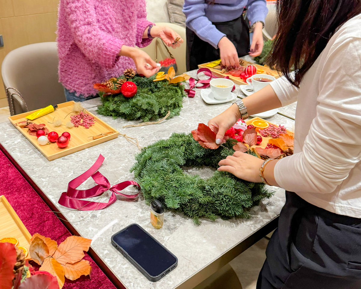
Every Let Hope Bloom floral design class begins with the logic of colour coordination—from selecting flowers and understanding the reasons behind each combination to completing your own creation step by step.
We teach not only techniques, but also how to think.
The course is held in a studio in a Grade A office building in Kwun Tong. Classes are small, and instruction is available in Chinese, English, and Cantonese. Beginners with no prior experience are welcome to enjoy the pleasure of fresh flowers together.